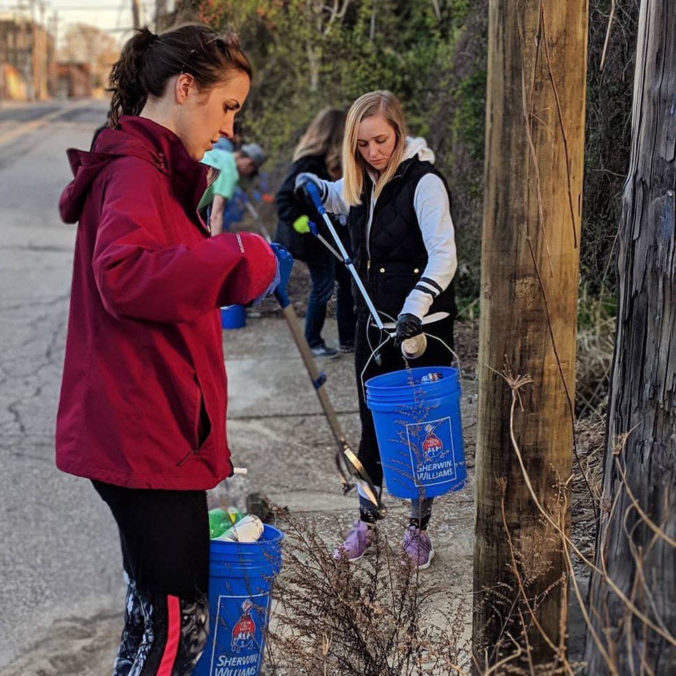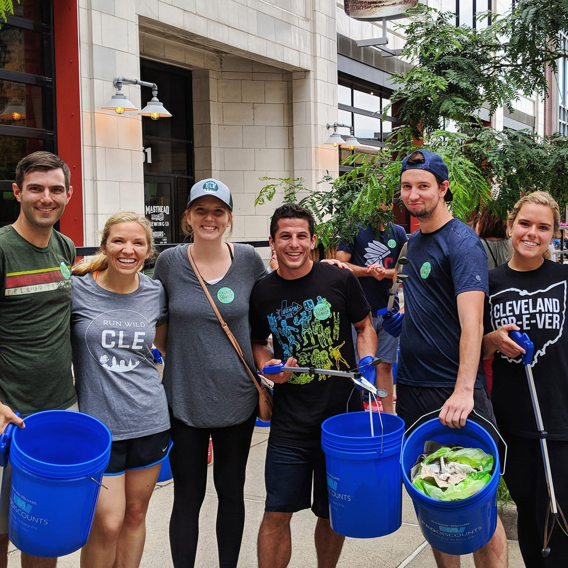
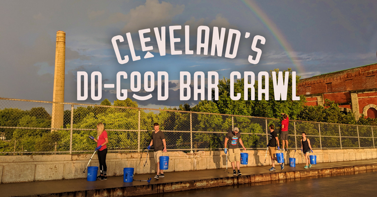
Clean Up Drink Up is Cleveland's do-good bar crawl, looking to give young professionals an opportunity to volunteer and give back to their communities, meet new people, support local bars and breweries, and have a good time.
Primary Clean Up Drink Up Logo
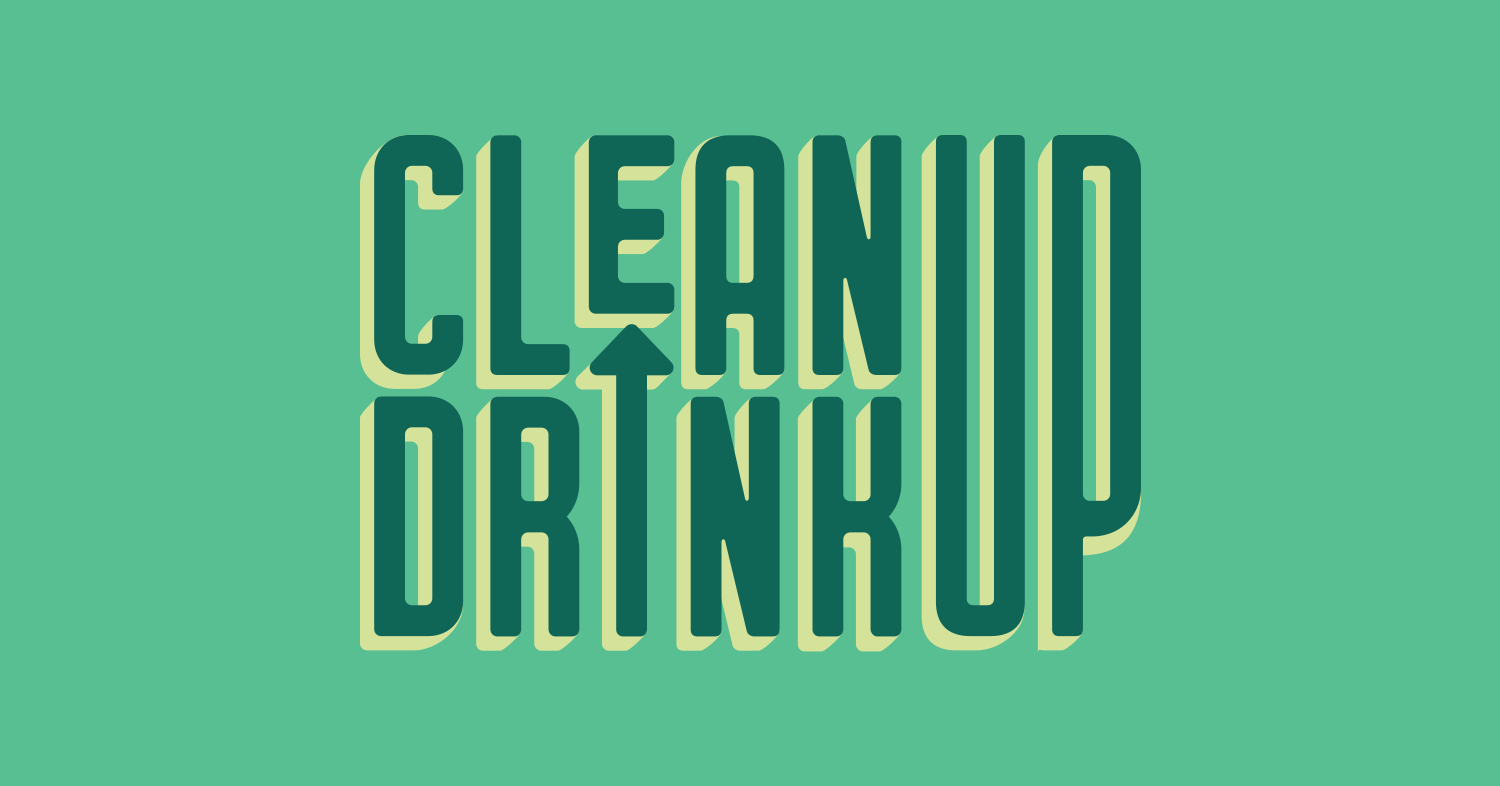
The sans-serif type is simple and un-fussy, with custom details that subtly highlight the "CLE" (for Cleveland) in "Clean," while the arrow in the primary logo reinforces "Up" visually. Overall, the brand's bright, positive feel will attract the target audience.
Primary Clean Up Drink Up Tagline
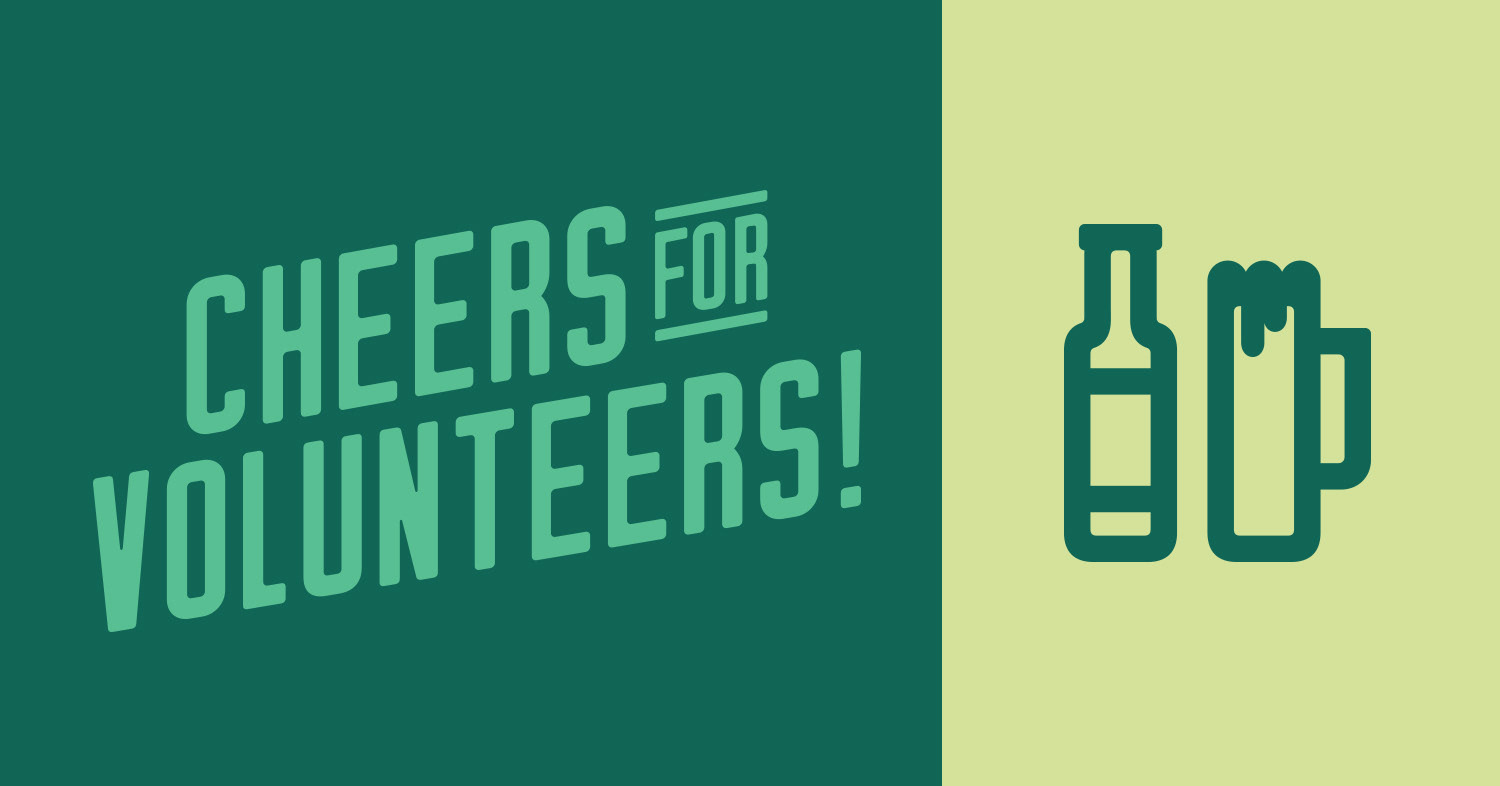
Secondary Clean Up Drink Up Tagline and Icon
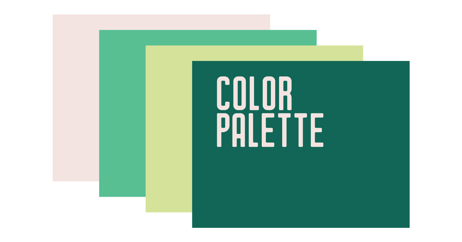
Clean Up Drink Up Brand Color Palette
In color theory, greens evoke balance, positivity, and refreshment, and symbolize nature and health. The pale pink, symbolizing compassion and youthfulness, serves as a colorful and complementary accent to the greens, with charcoal and white as base neutrals. These colors lay the foundation visually for the brand's core values.
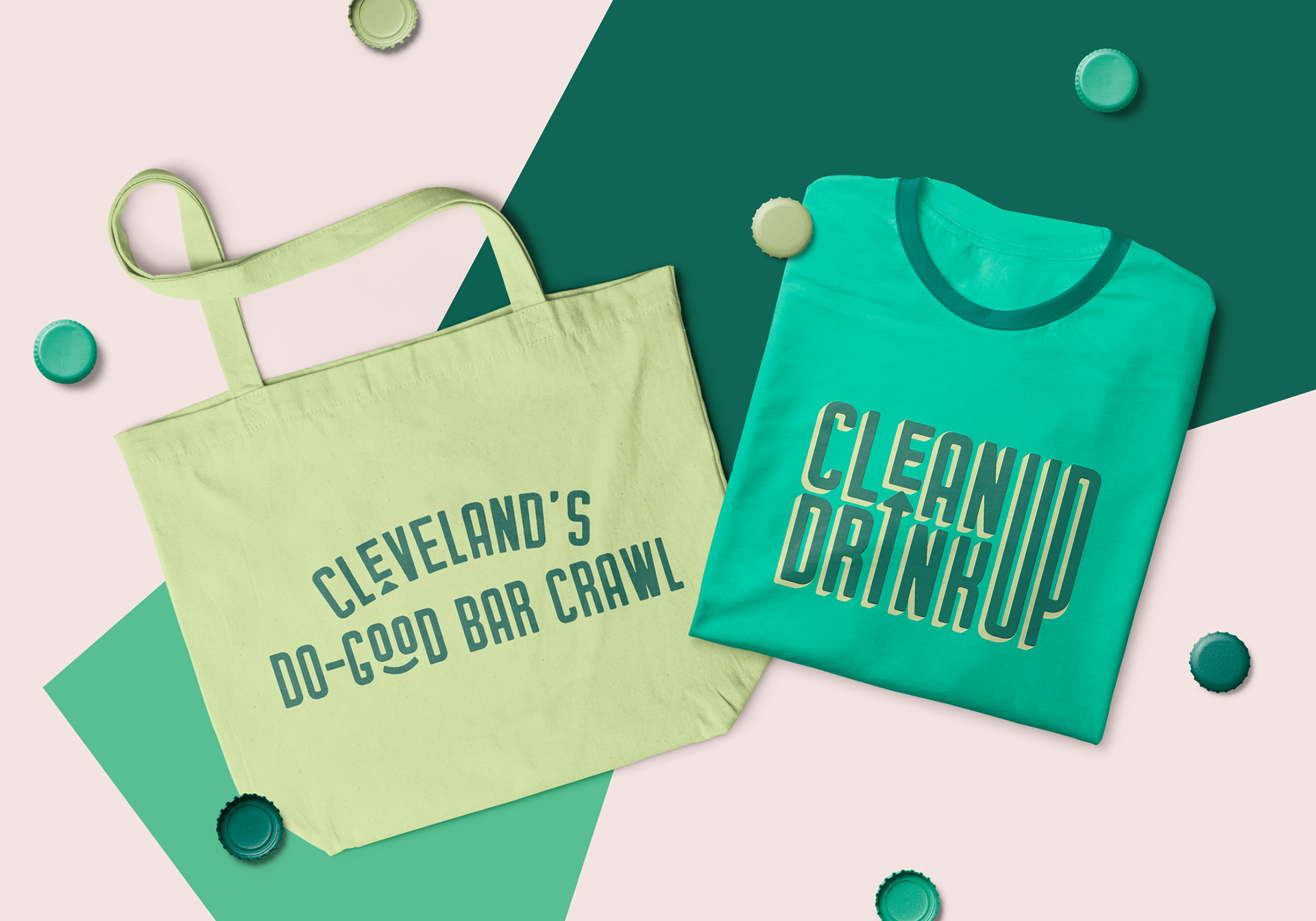
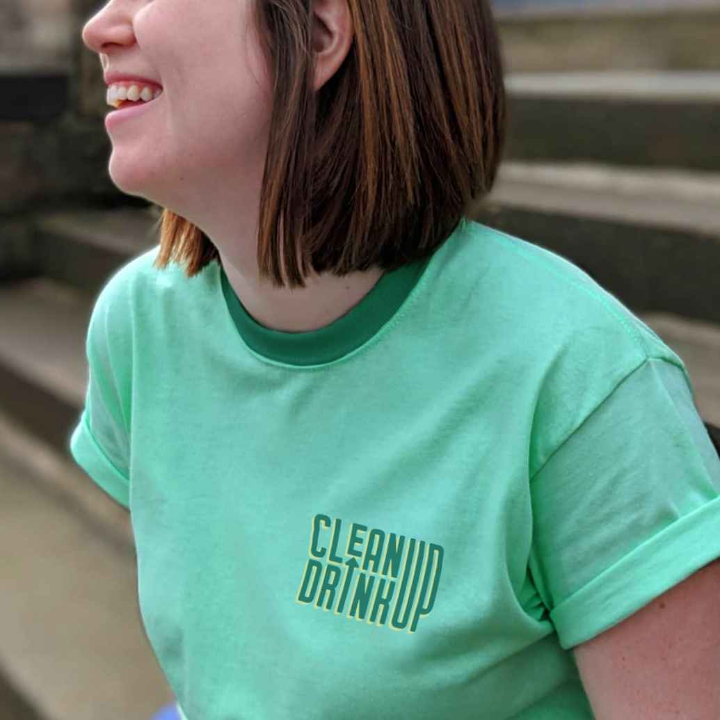
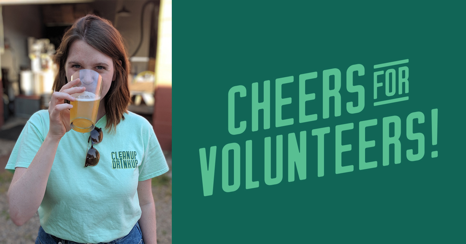
Clean Up Drink Up Brand Merch
"Alexa worked with me as a brand consultant and I was wowed every step of the way. This was my first time looking for help to create a logo, and she guided me through the process with patience, ease, and professionalism. She stuck to our timeline and made sure I was happy with the product at each phase of the design process. Her creativity, clarity, and vision were instrumental to creating beautiful and successful branding for me, and I simply love what she produced - I can't stop looking at it! I absolutely recommend Alexa for your next project."
- Jessica Trivisonno, Founder