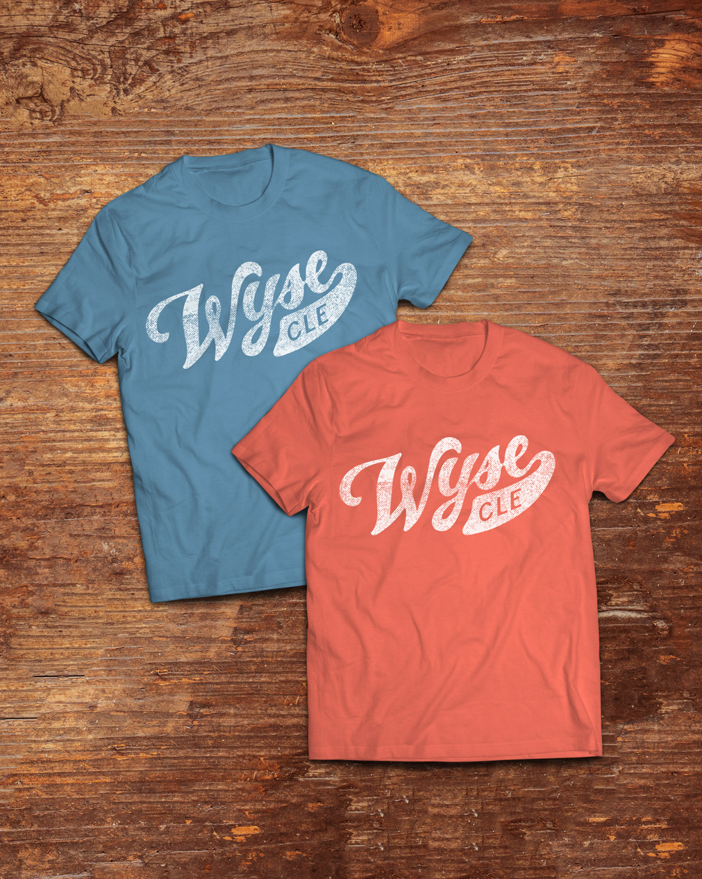
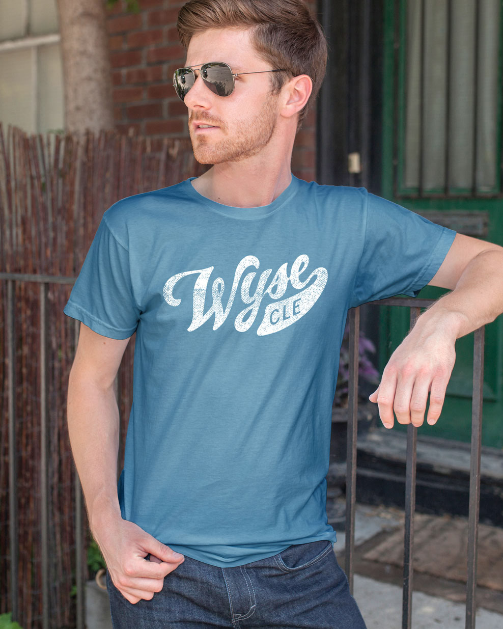
Wyse brand refresh mood board.
Marc and Lois Wyse, agency founders, were avid collectors of vintage advertising posters, which are still on display all over the agency. Given the Wyse legacy, it was only fitting to draw inspiration from these classic advertising pieces and put a fresh spin on it.
Updated Wyse Advertising color palette inspired by vintage advertising posters
Updated iconography, using the same graphic style and line weight.
Wyse letterhead, business cards, and collateral. Custom W pattern on envelope liners.
Updated business cards, with quotes from each agency member.


Internal Harvest for Hunger Food Drive posters.
Wyse web process graphic, for use in explaining the agency's web development process in presentations and on the website.

